VIRTUAL ACCOUNT NUMBER UX
VIRTUAL ACCOUNT NUMBER UX
PROBLEM
Citi’s previous Virtual Account Number experience was a downloadable service and wasn’t user-friendly – leading, predictably, to very low customer engagement. It also fell far short of Citi’s increasing security standards.
SOLUTION & IMPACT
The team and I designed an entirely new online experience for browser and mobile. The new experience included several new features, such as the ability to set spend limits and assign nicknames to individual Virtual Account Numbers. Plus, we introduced a much more robust dashboard.
This experience encompasses a number of copy styles, including a promotional landing page, user-friendly set-up flow and clean dashboard that depends heavily on microcopy.
The new Virtual Account Number experience is projected to gain 200,000 new users in its first year.
LANDING PAGE
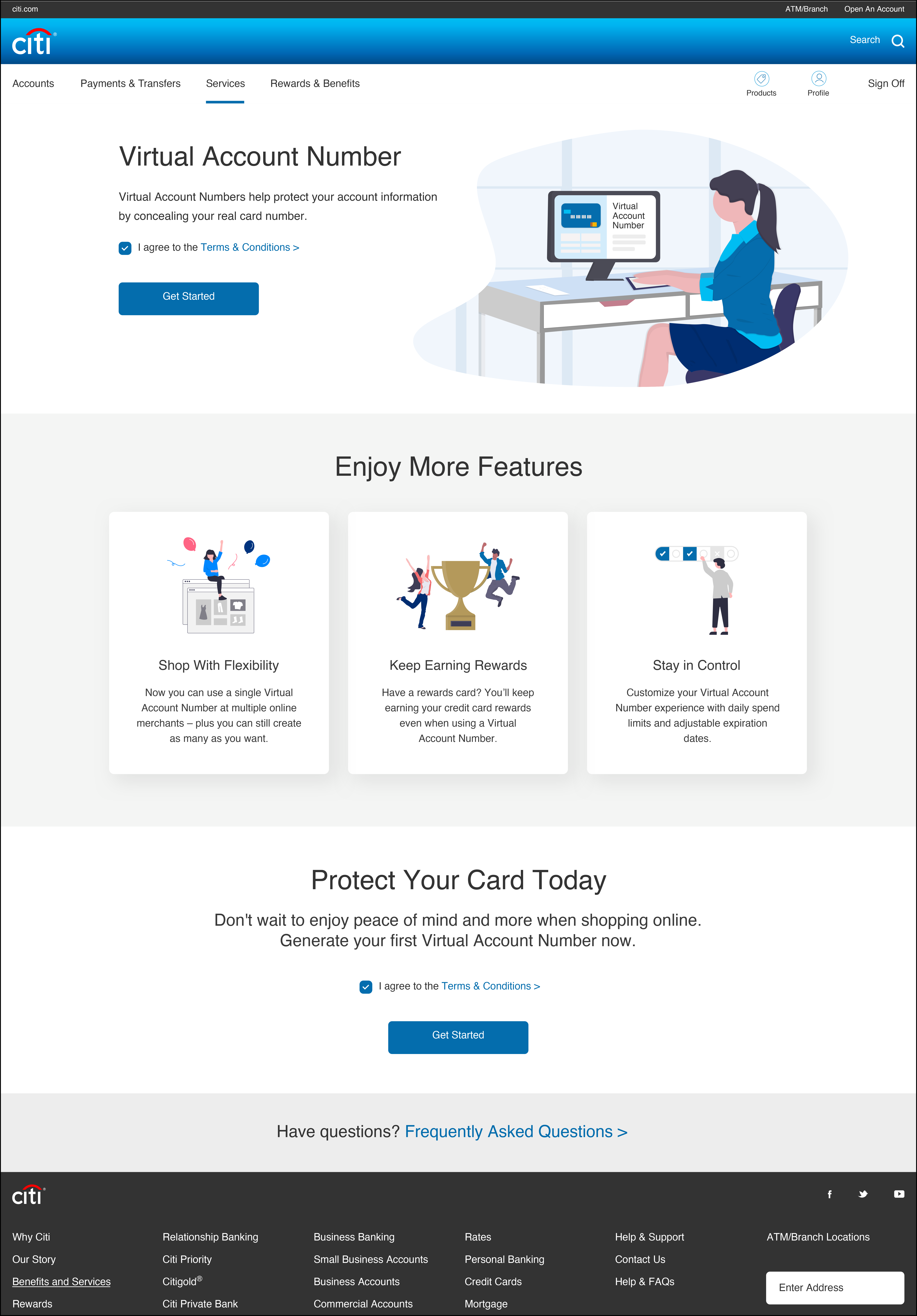
The landing page only appears for new Virtual Account Number users. Once a customer has generated their first number, they will be directed straight to the Dashboard.
I wrote the landing page to be more promotional because customers will be completely new to this experience and will likely need to be sold. The legal team needed the opening paragraph to be purposely vague, so I made use of the tiles below to ennumerate product features (these tiles become a carousel in responsive views and Citi’s mobile apps). At the bottom of the page, I placed another promotional call-out.
Note: Since we didn’t want users to have to accept Terms & Conditions for every Virtual Account Number they created, we also made the unorthodox decision to put them at the beginning of the flow.
LANDING PAGE

SET-UP FLOW
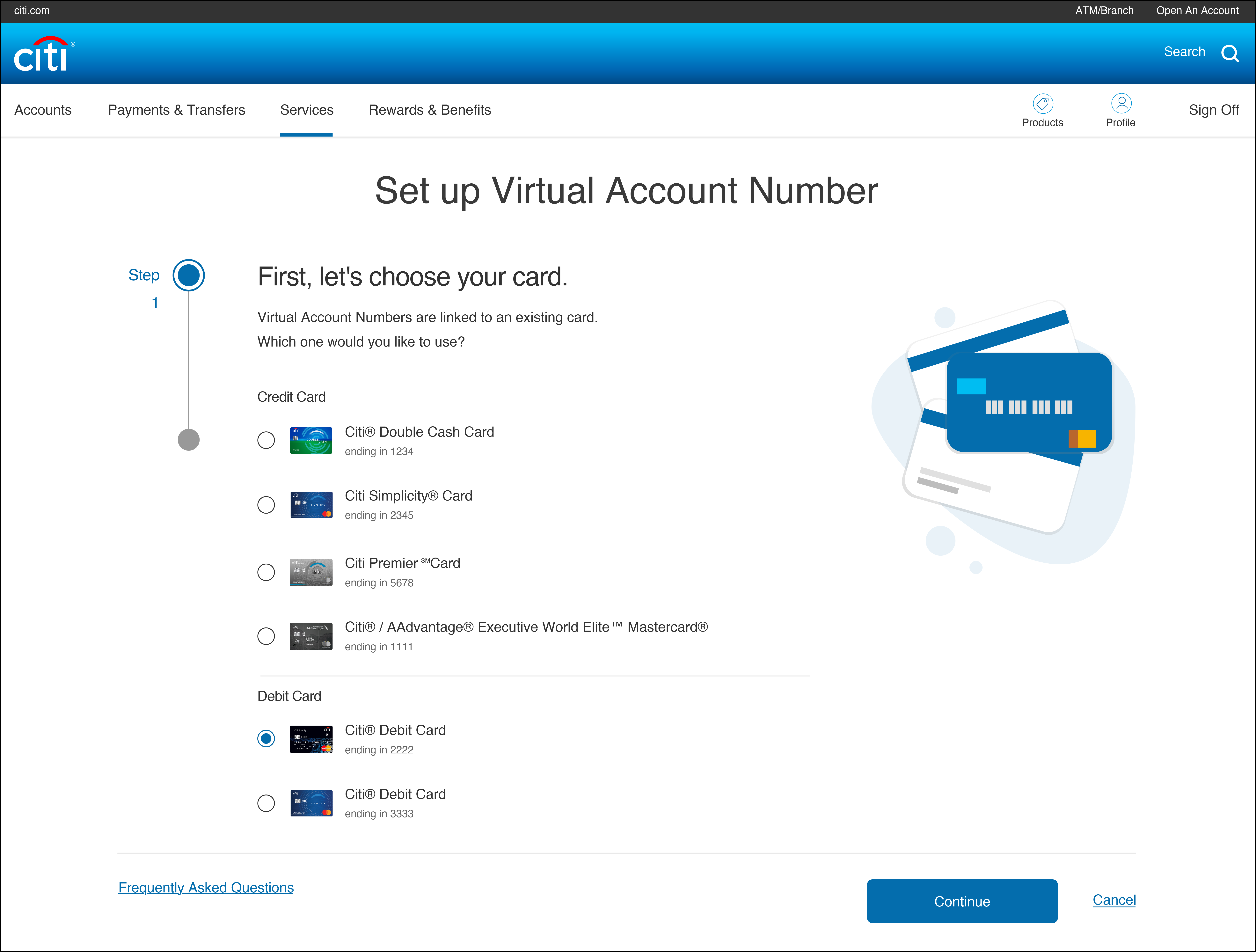
Screen 1: I decided that separating credit cards from debit cards on this screen would eliminate any possible confusion the users would have when choosing their card.
CHOOSE A CARD

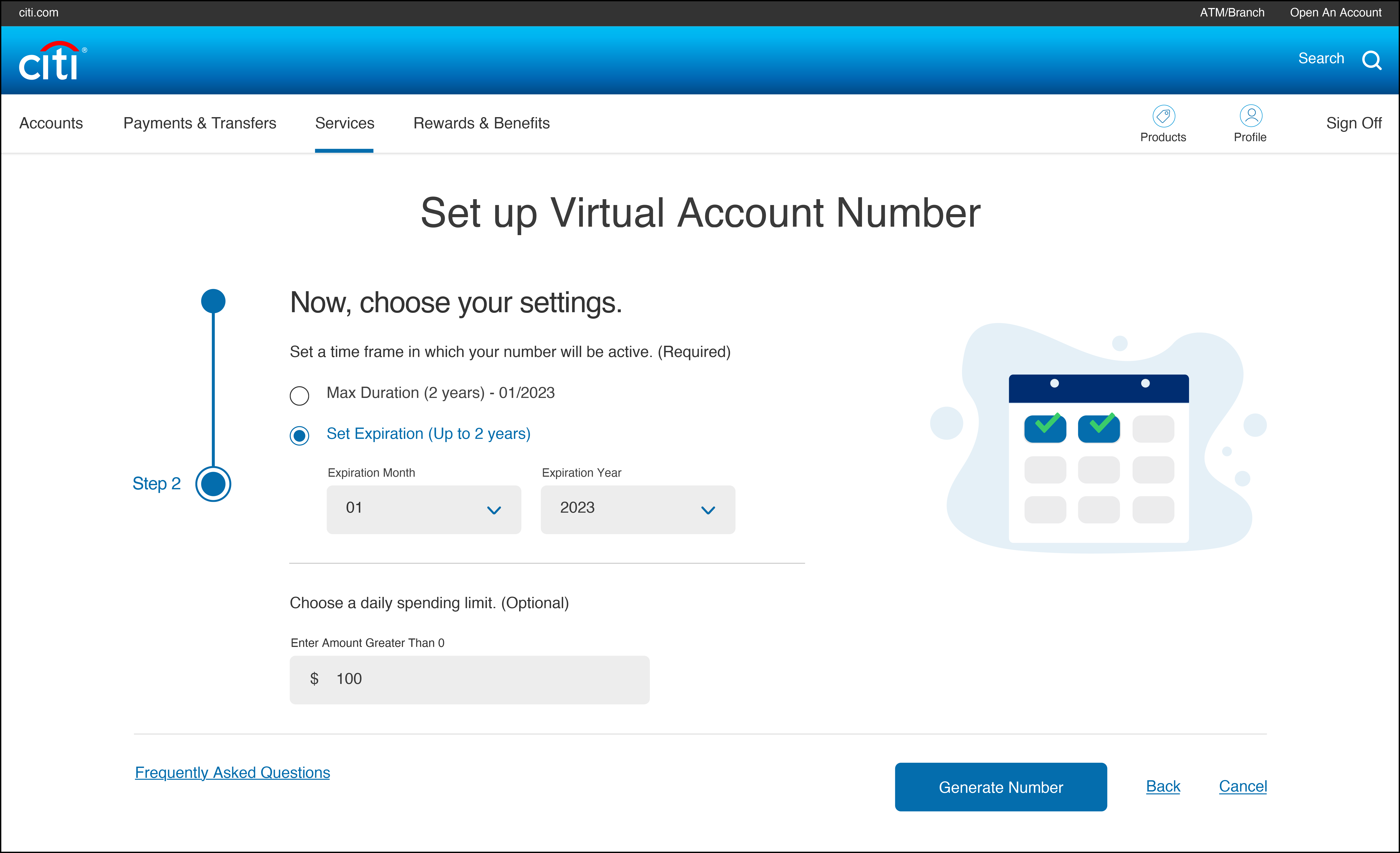
Screen 2: Early concepting involved having the duration and spending limit on different screens. Upon seeing it, however, I realized the content would flow better on one screen, plus it would remove a click. I consolidated these two screens under a “settings” header and separated them with subheads.
CHOOSE SETTINGS

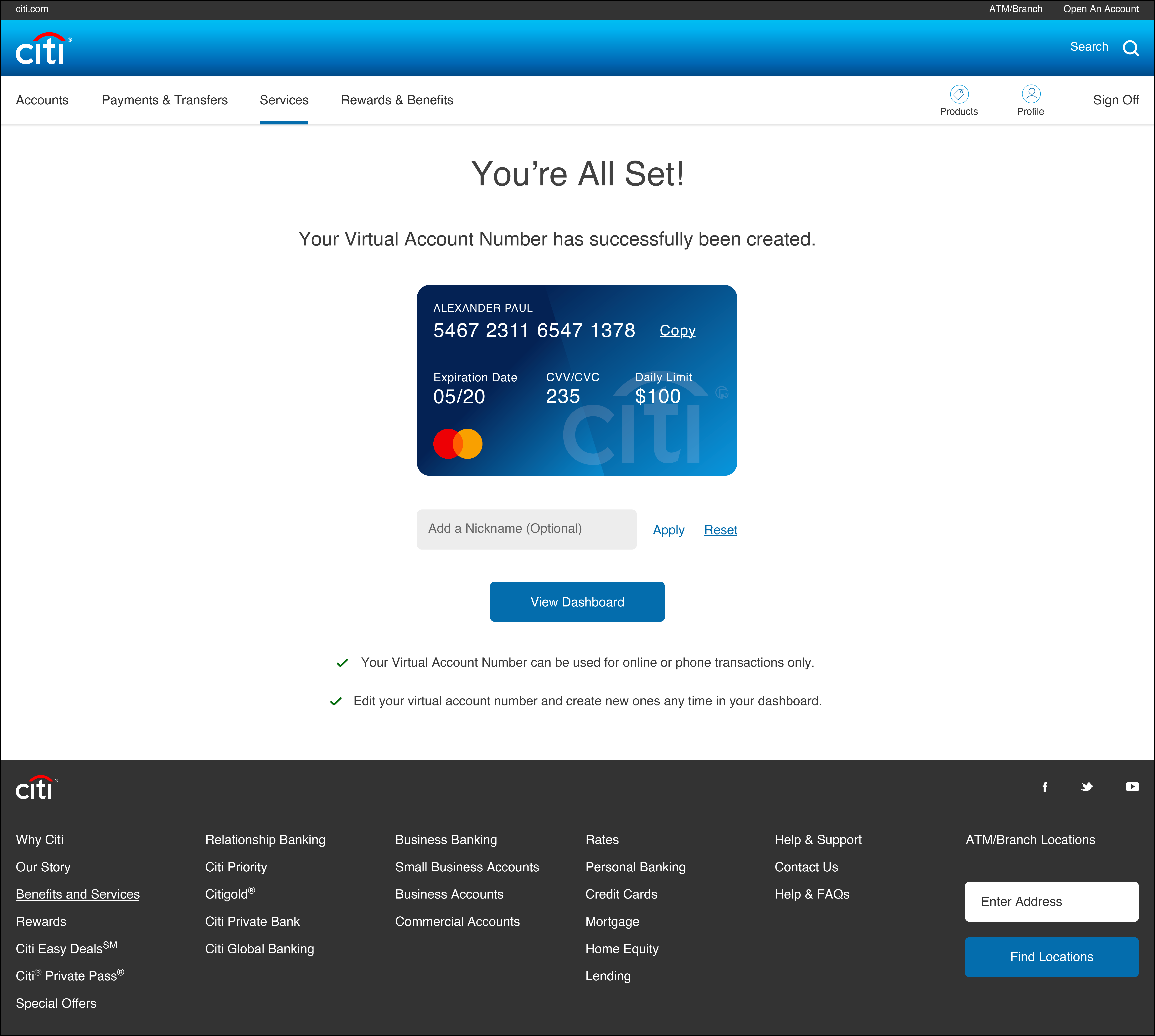
Screen 3: The confirmation screen required a good amount of accessibility notes in the copy deck to relay the information on the card image and specify that they needed to click the image to copy the card information.
CONFIRMATION

DASHBOARD
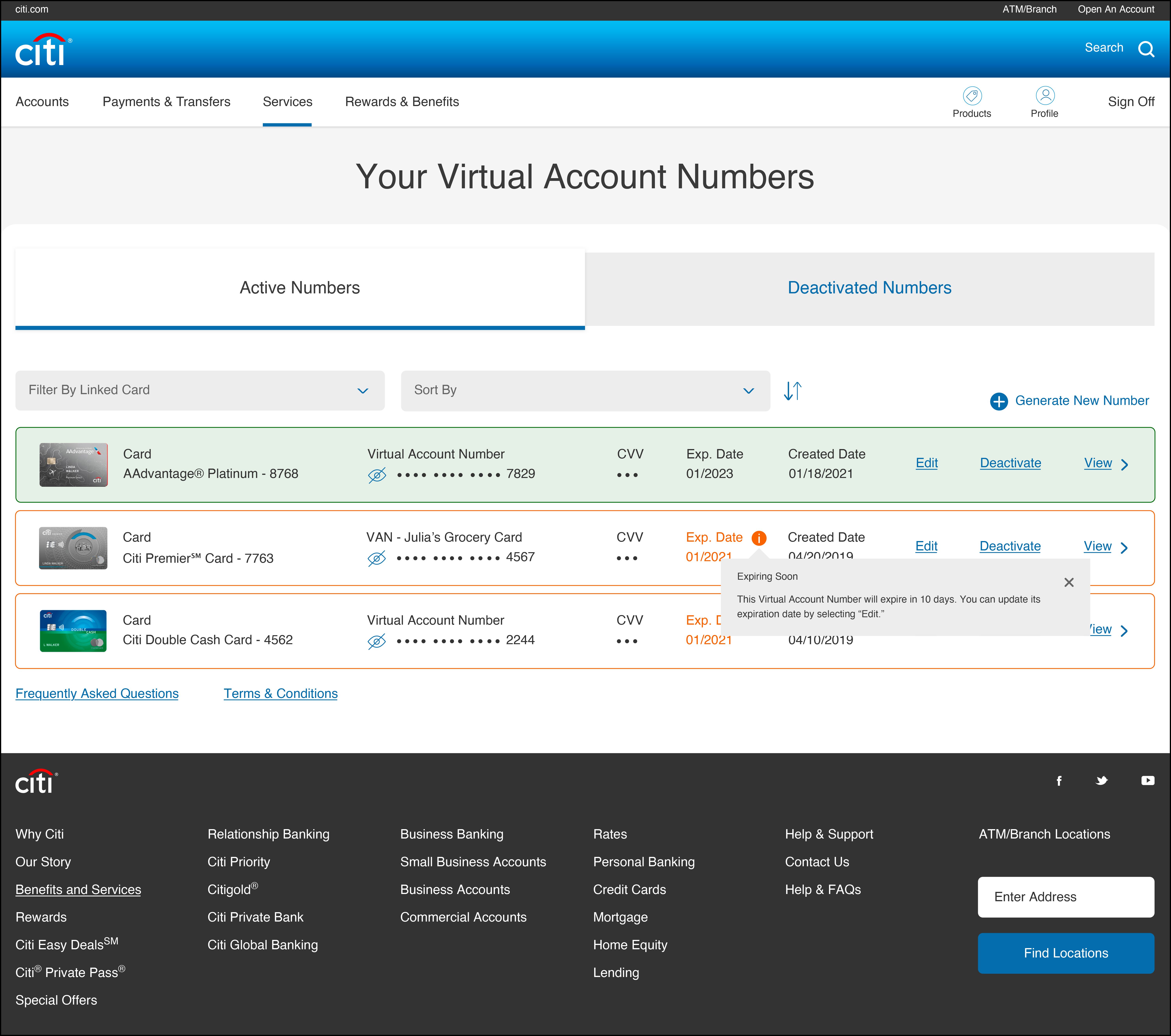
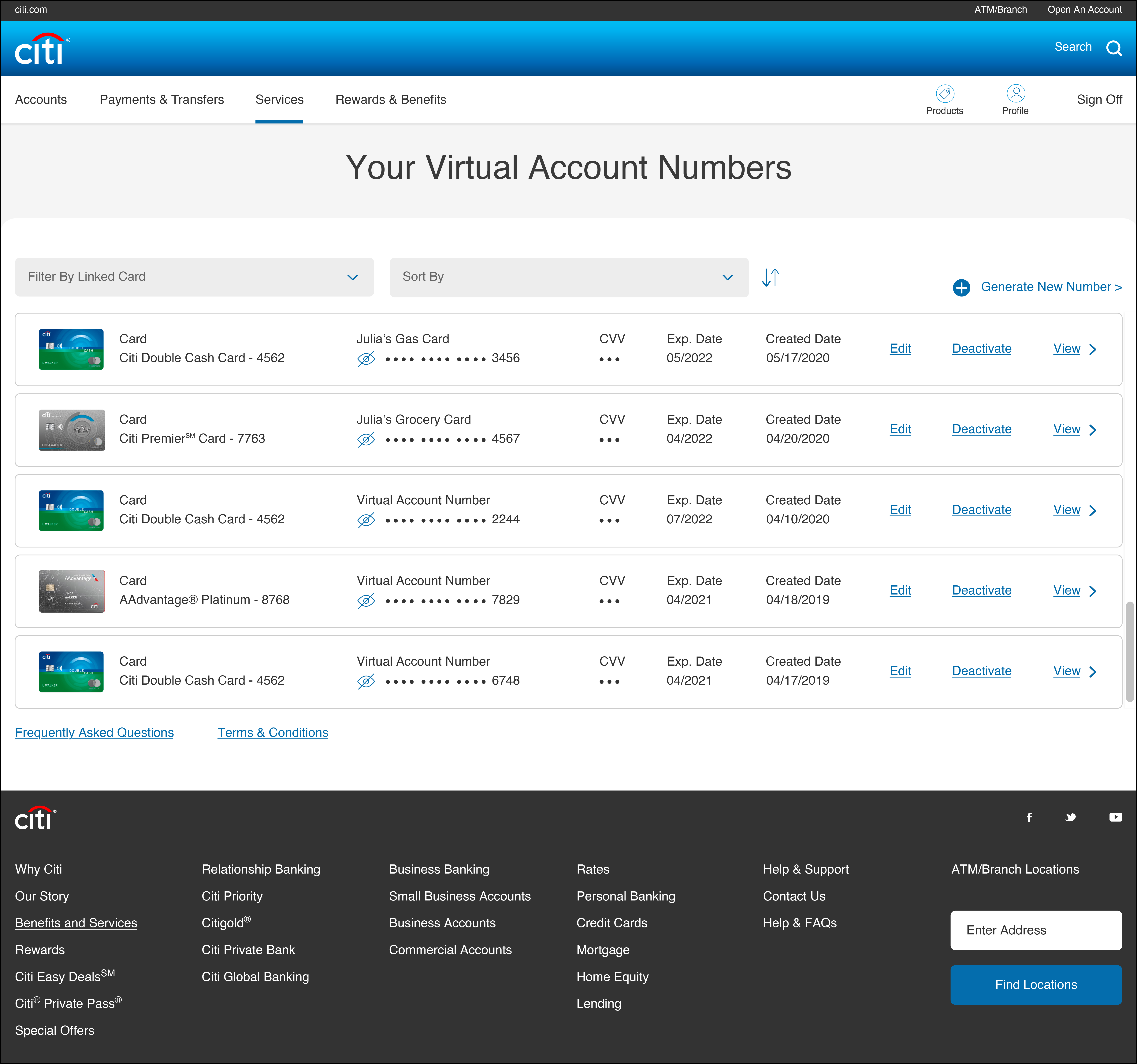
Screen 1: The dashboard is clean and intuitive, allowing the customer to create a new Virtual Account Number, edit or deactivate an existing one, and view transactions for a specific card.
DASHBOARD

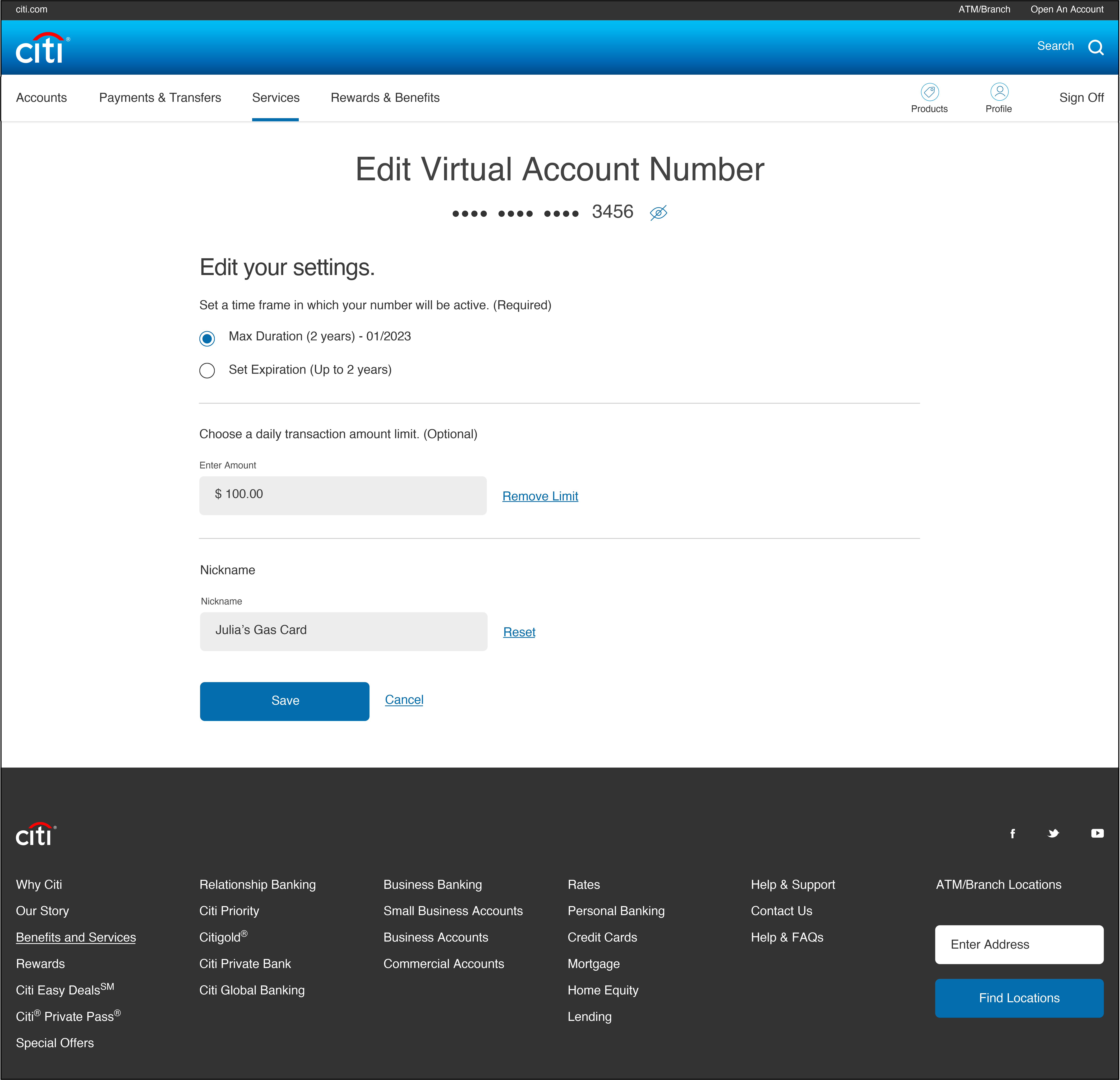
Screen 2: All editing takes place on one screen, making it easy for the user to see all their changes without having to click through multiple screens.
EDIT A VIRTUAL ACCOUNT NUMBER

Screen 3: After editing, the card’s row turns green on the dashboard to indicate success (if there’s an error, the user will receive an inline error on the edit screen). Cards that have expired have a red border, and cards that are about to expire have an orange border. Both are explained by a tooltip as well as additional accessibility notes.
You’ll also see in Screen 3 that when there are deactivated numbers, tabs appear above the ledger to delineate them from active numbers.

SUCCESS & EXPIRING SOON
